
September Update: New Design, One Builder for Everything and Your Result to Share
Season 2 is in its final days, and on Monday Season 3 takes over. With the season change, our weekly update rhythm ends too. From now on Matchplan gets one big update a month, and the first is the biggest we have ever built. Matchplan has a new logo, new card designs, new packs, a new way to get around. All three modes now build their board the same way, the card picker fills your lineup live, and for the first time you can share your scored board as a picture. Plus a look at what is already waiting for the 2026/27 season.
The new rhythm: one update a month
Since launch we have shipped every week. With Season 3 we change the beat: one big update a month, with patch notes like these. Small fixes in between remain possible.
The new design: four principles, one tap
The new design follows four principles: Every action is one tap away. Building a board is simpler than before. Everything responds at once and explains itself. And it works on every device, from a small Android to the biggest iPhone.
One typeface instead of three, three colours instead of a dozen, and one grid that is the same on every screen. Green now only marks where something is waiting, what is live and where your row sits. The buttons are white.
Home is rebuilt. Your board for today sits on top with countdown, lock-in status or result, below it Packs, Objectives, League and Exchange as four icons, then your Friends League and your Season Pass side by side. The header floats as glass over the content and you scroll underneath it. What is new, what is live, what is coming: the news collection tells you without a hunt.
- The menu: top left, above your profile picture, the sidebar opens. Cards, Album, Friends, Packs, Profile, all within one screen height. If a reward is waiting somewhere, the entry carries a mark. One tap and you are there.
- Glass instead of stacks: Cards, Friends, League, Season Pass, announcements and Exchange open as a glass overlay above whatever you are doing. One tap takes you back.
- New icons, new start: the app icon and the widget carry the current wordmark, and the splash screen breathes until the app is ready.
- Every device: spacing, type sizes and touch targets follow one grid that works on small Android screens as well as on the biggest iPhone. The tab bar keeps your device's real edge clear, not an assumed one.
The new brand: one logo, new cards, new packs
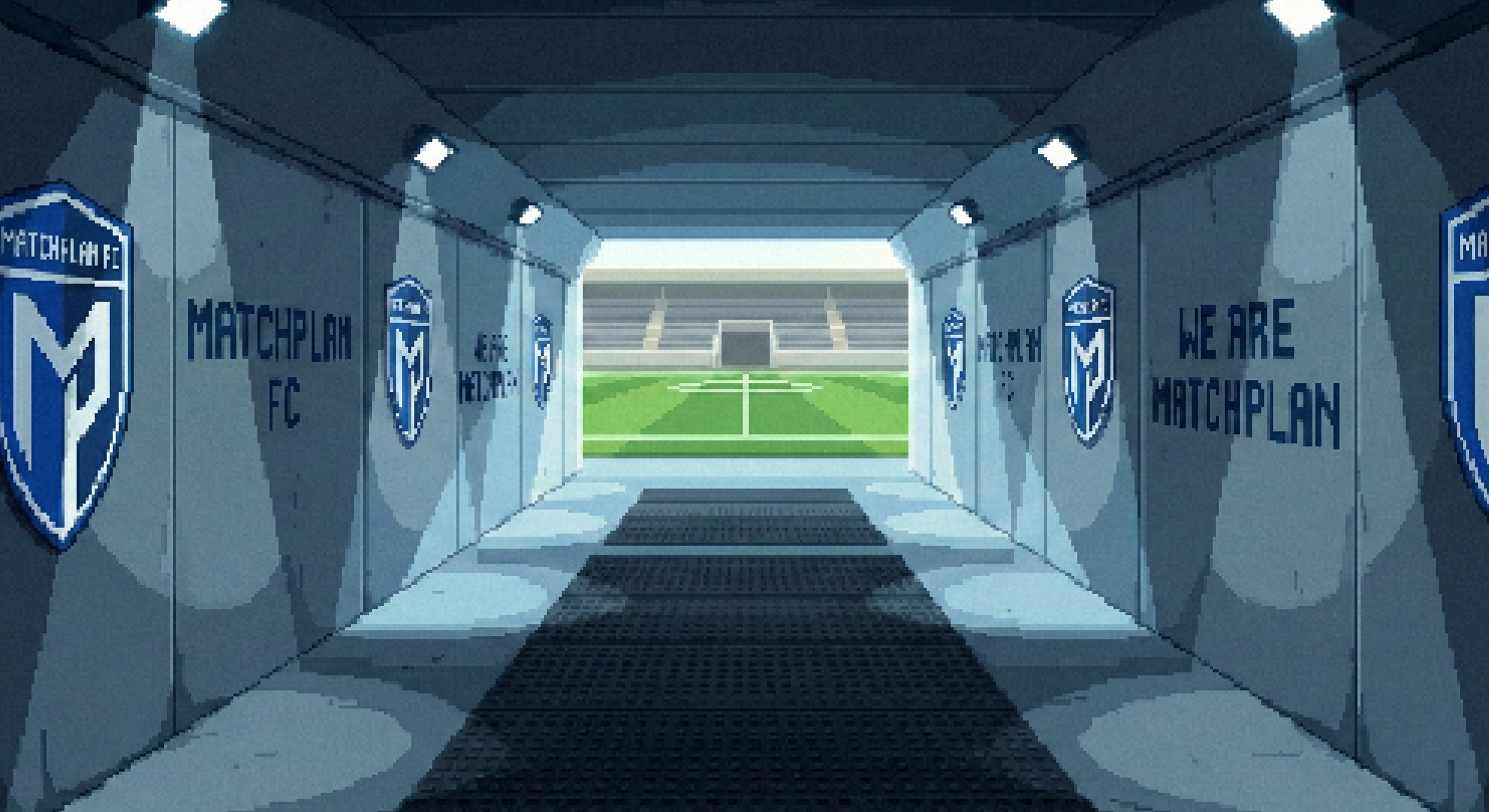
Matchplan has a new logo: the wordmark in green on a dark ground. It sits on the app icon, on the widget, on the splash screen and on every card.
- New cards: every card in your collection wears the new design. The same typeface as the app, the rating top left and the rarity in its familiar colour. Your call sits as a line at the foot, readable even in the small grid. What does not change: rating, rarity and how often you can play it.
- New packs: every pack has a frame whose material shows its tier, bronze, silver, gold, and its own colour. Event packs carry the colour of their event. You can tell from the frame what is inside. The standard packs are reworked as well, you will find them in the Store.
One board builder for all three modes: your lineup, the same everywhere
Daily, Weekly and limited time events had three different routes to a finished board. Now there is one. Every mode shows its matches on top as a pager, below it your lineup: five slots as a row of cards, and the same five as a list with call and rating.
- The card picker, full screen: tap a slot and your collection opens over the full height. Your five slots sit on top and fill live while you choose. A tap on a placed card takes it out again. Search is always open, the filter sits next to it.
- Weekly goes live: your Weekly Matchplan now shows the running score, goals and provisional points on the match card during the game (for selected matches). Until now only the Daily could.
- Double up on its own page: choosing which match counts double has its own screen with all of the week's matches side by side. If the match has already kicked off, the page says so instead of silently blocking.
- Lock-ins hold: if your connection drops while locking in, the app keeps your full board and sends it as soon as you are back online. The kickoff clock comes from the server, not from your phone.
Results: your duel in the board design, your board as a picture
The duel reveal now shows both lineups as rows of five, yours on top, your opponent's below, every card with its points. No more swiping. The match sits as a box in between, exactly like in the daily duel.
And for the first time you can share your scored Daily board as a picture. Tap "Share your result" under "Points earned" and the app builds an image with your board, your points and a link. Whoever opens the link sees your board without having the app.
Quality of life and UX updates
- Collection: three cards per row, the same grid as the picker. The switch between Collection and Album floats as glass.
- Keyboard: a tap beside it or a scroll closes the keyboard everywhere, including the reset code and the age step in sign-up.
- League push: a push from your Friends League opens the league, not the Friends hub.
What comes next: the 2026/27 season and the Points Store
For the 2026/27 season, a lot is already prepared. Limited time events for the big weeks of the calendar, new packs, new objectives, and season by season its own pass. Most of it does not arrive as an app update, it simply appears in the game when its week comes.
And the Points Store is going live soon. Store Points, which today you can only earn, you will then be able to buy, for packs, refreshes and the Premium Track in the Season Pass. What you cannot buy with them stays the same: a place in the table. A date follows once it is fixed, fourth quarter at the latest.
Try it on the next matchday
That was version 2.0, the September update, live now on the App Store and Google Play. Build your board in the new picker, share your first result, and tell us on Discord how the new app feels. The next big update comes in October. Your feedback shapes what goes in.